Building a webapp to visualize DMV wait times
One thing I enjoy about building complete, data-driven web applications is that you get to work with the data pipeline from start to finish.
You need to get your data, clean it up, enrich it, transform it, analyze it, and finally visualize it.
It’s particularly tempting, but ultimately counterproductive, to develop a narrow focus in just one of these. For example, it’s common for data and business analysts to know how to analyze data. They can take datasets, facet them in different ways, run some descriptive statistics and ultimately produce actionable insights. That’s where I started my career, and probably where most analysts do as well.
But quickly I figured out that most data is not ready to be analyzed as-is. Often, you need to get the data, which may come from APIs, text files, database dumps, FTP files or scraped DOMs from online webpages. Somehow you then need to normalize and consolidate this data, which often comes in a variety of different formats. Then you have to clean up the data, and finally run your analysis.
Of course, actionable insights backed by a table of numbers is good, but not great. Downstream stakeholders probably don’t want to look at table of numbers - they want to see patterns that jump immediately jump out to them in graphs and charts.
So I think that working from data from start to finish is a great way to build out skills related to data engineering, data governance, data analysis and data visualization. I’ve personally found that building interactive webapps is a particularly good way to visualize data since, unlike .png images or .pdf reports, you can manipulate the analysis in real-time.
After I recently went to the Danbury DMV in Connecticut to get my license renewed, I thought of a decent project idea to keep practicing some of these skills.
All branches of the DMV conveniently display the current wait times for individual services at their branch. These can differ substantially: it might take 20 minutes to renew your license, but 60 minutes for an out-of-state license transfer.
The problem with this data is that it only gives a snapshot of the wait times at any given moment. If the wait time is currently 30 minutes, you can’t really tell if an hour from now will be better or worse. For that, we’d need time series data.
So I decided to scrape this data using Python’s requests, BeautifulSoup and pandas every 5 minutes. I saved this as a django management command, which the Heroku scheduler kicks off every 10 minutes (the minimum frequency allowed by Heroku).
def extract_wait_times(branch, data):
    """Accepts a payload, POSTs to the resource endpoint and returns a table"""
    data.update({data['_EVENTTARGET']: branch})
    response = requests.post(URL, data=data)
    soup = BeautifulSoup(response.content, 'html5lib')
    try:
        table = soup.select('table[id*="WaitTimes"]')[0]
    except IndexError:
        return pd.DataFrame()
    else:
        return pd.read_html(str(table))[0]

def scrape_branches() -> list:
    """Scrapes list of branches & builds required payload from website"""
    response = requests.get(URL)
    soup = BeautifulSoup(response.content, 'html5lib')
    form = soup.find(id='aspnetForm')
    branches = [
        b.attrs['value'] for b in form.find('select').findAll('option')[1:]
    ]
    target = form.find('select').attrs['name']

    # Build payload
    data = {i.attrs['name']: i.attrs['value'] for i in form.findAll('input')}
    data.update(
        {'_EVENTTARGET': target, '_LASTFOCUS': '', '_EVENTARGUMENT': ''}
    )

    # Iterate over each branch
    dfs = [extract_wait_times(branch, data) for branch in branches]
    return list(zip(branches, dfs))
Once I had the dataframe of data for each branch, I stored each service’s wait time as an individual “wait entry”, whose data model looked like this:
class WaitEntry(models.Model):
    """An individual wait time entry for a given branch"""
    branch = models.ForeignKey("Branch", on_delete=models.CASCADE)
    service = models.ForeignKey("Service", on_delete=models.CASCADE)
    wait_time_str = models.CharField(max_length=60, null=False, blank=False)
    wait_time_mins = models.IntegerField(null=False, blank=False)
    num_waiting = models.IntegerField(null=False, blank=False)
    creation_date_utc = models.DateTimeField(auto_now_add=True)
Now that the data was being stored, I had to expose it over an API for the frontend to consume. I wanted the API to accept a variety of parameters that would allow you to filter by historical data date range, service type and branch.
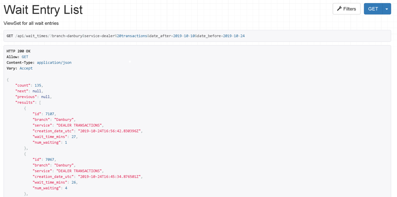
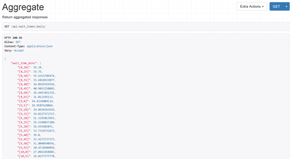
I also wanted to show average wait times over various periods: if I was looking at a month, when was the best day to go? If a week, what day of week? And if a day, what time of day? I created some API endpoints to return this monthly, weekly and daily aggregated data.
At this point, the data is stored, analyzed and exposed. Now comes the frontend work to actually get it displaying.
While I manage the development of our Vue.js frontend for EarnLocal, this was my first time coding in Vue.js myself. There are some major benefits to working with a modern JavaScript framework than with working with plain vanilla JavaScript.
First, you get to work with the virtual DOM. This means you aren’t actually querying the entire DOM tree and offloading DOM manipulations to the browser, which it wasn’t really designed for, each time you do a JavaScript action. Instead, you do all the querying/manipulating within the virtual DOM, and only changes are sent to the real DOM for updating. This is much faster.
Second, you get “reactivity”, which basically means that everything in your HTML and JavaScript stay in sync. If you input something on a form in the HTML, the corresponding JavaScript is immediately notified, and if this plugs into another HTML element, that element is immediately notified as well. All this instantaneous, two-way data binding is abstracted away when you use a framework like React or Vue. Practically speaking, this means a lot less code.
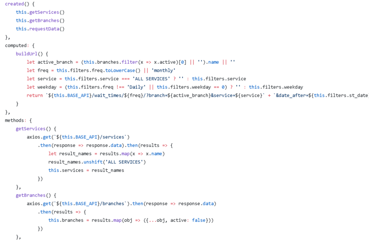
Getting started with the basics of Vue.js is fairly simple. Within any given component, there’s the template: the place you store your HTML code. Then there’s the script, which is where you store your JavaScript state and logic. Finally, there’s the style for any CSS styling that’s scoped to this individual component.
In other words, the structure, logic and styling of a page is neatly bundled into a single, pluggable unit called a component.
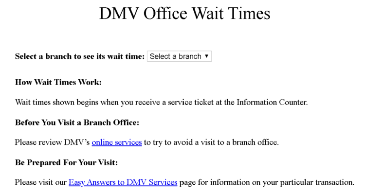
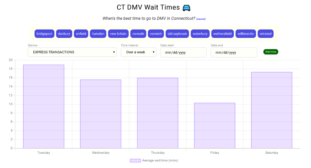
In the case of this app, www.ctdmvwaits.com, I used just a single component that queries the backend REST API upon loading. Then, as a user toggles the various filters, those send additional API requests to the backend, and the response is used to repopulate the Charts.js graph.
I did the CSS styling mostly as an opportunity to familiarize myself with flexbox and CSS grid - as I expected, these were pretty simple to use once I got the hang of it.
Overall, the app turned out pretty well. It’s clean, snappy and - most importantly - informative. As I think is common for data analysts, patterns you think are “intuitive” aren’t always so once you begin drilling down into the data and cutting it up in different ways. You can see my thoughts on the data in my post here.
I posted the app to Connecticut’s Reddit forum to get some feedback, and the response was fairly positive. I think a lot of people have frustrations about waiting at the DMV, and getting some cold, hard data about just how long wait times are gives them a better way to plan ahead.
I also did a short interview with the CT Post to talk about the webapp. Interestingly enough, the reporter had already been planning to write about the DMV and joked that I would’ve made his life much easier had I posted this up just a few weeks earlier. Well, now it’s up at least.
If you want to run your own analysis on the data, I added an API endpoint for easy downloading to .csv. You can do so by following the directions on the GitHub README page, or by simply using this link:
https://ctdmvwaits.com/api/wait_times?format=csv&page_size=5000
Overall, I’m happy a lot of people found utility in the tool and I hope that as it collects more data, people will continue to find it useful. You can find the full webapp by visiting this link: www.ctdmvwaits.com.